Designing an accessible Web3 portal by delivering a consistent UX and a scalable design system.
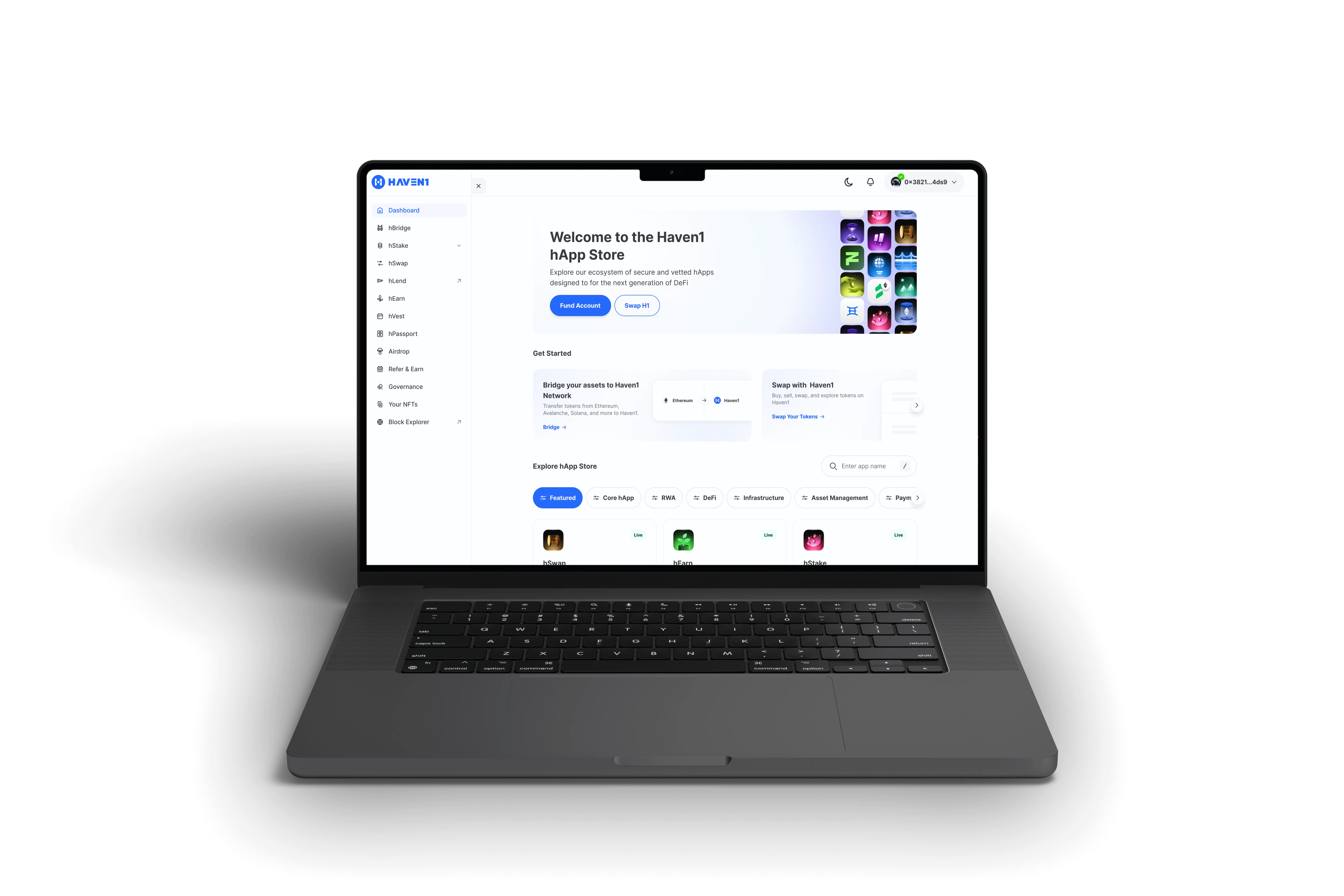
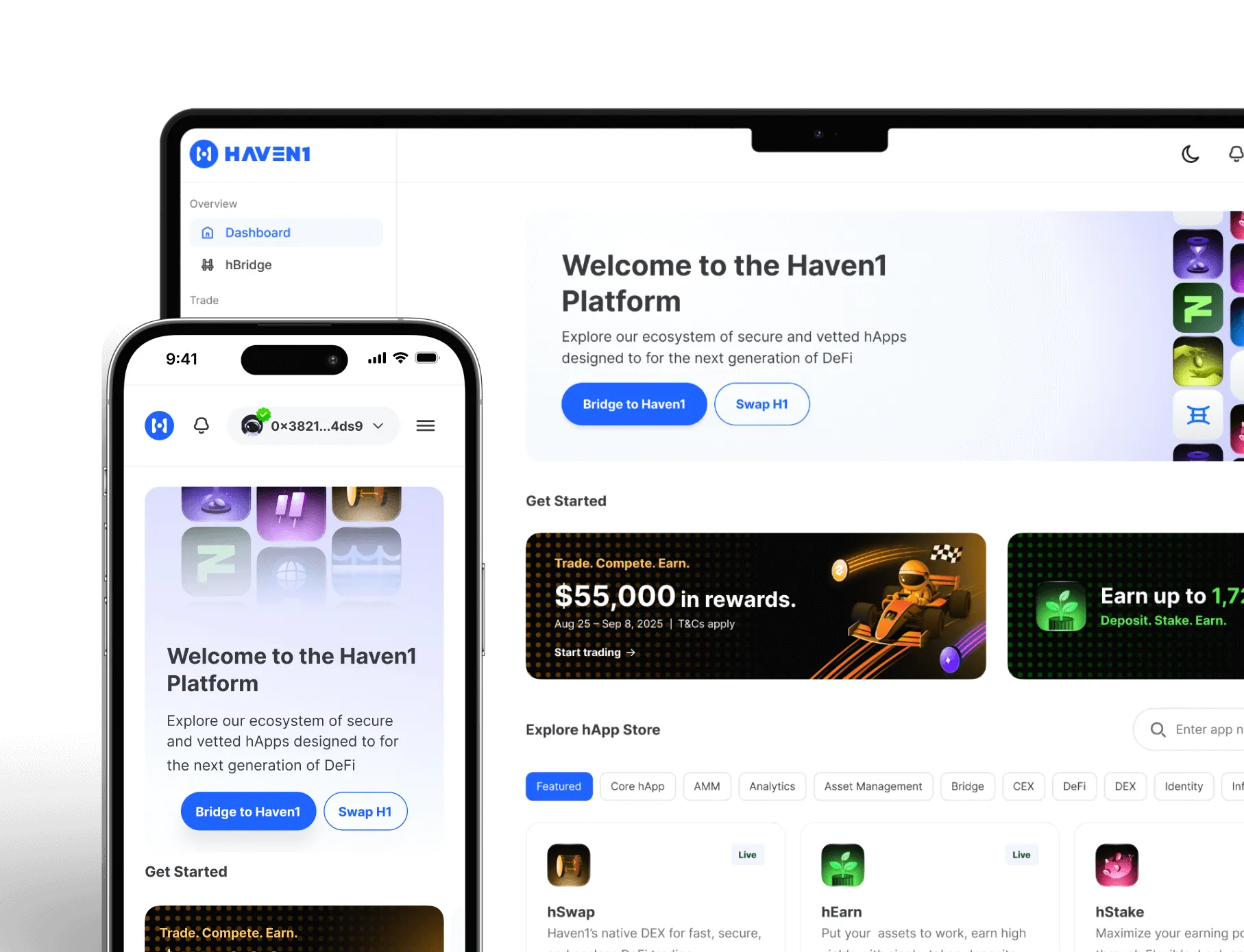
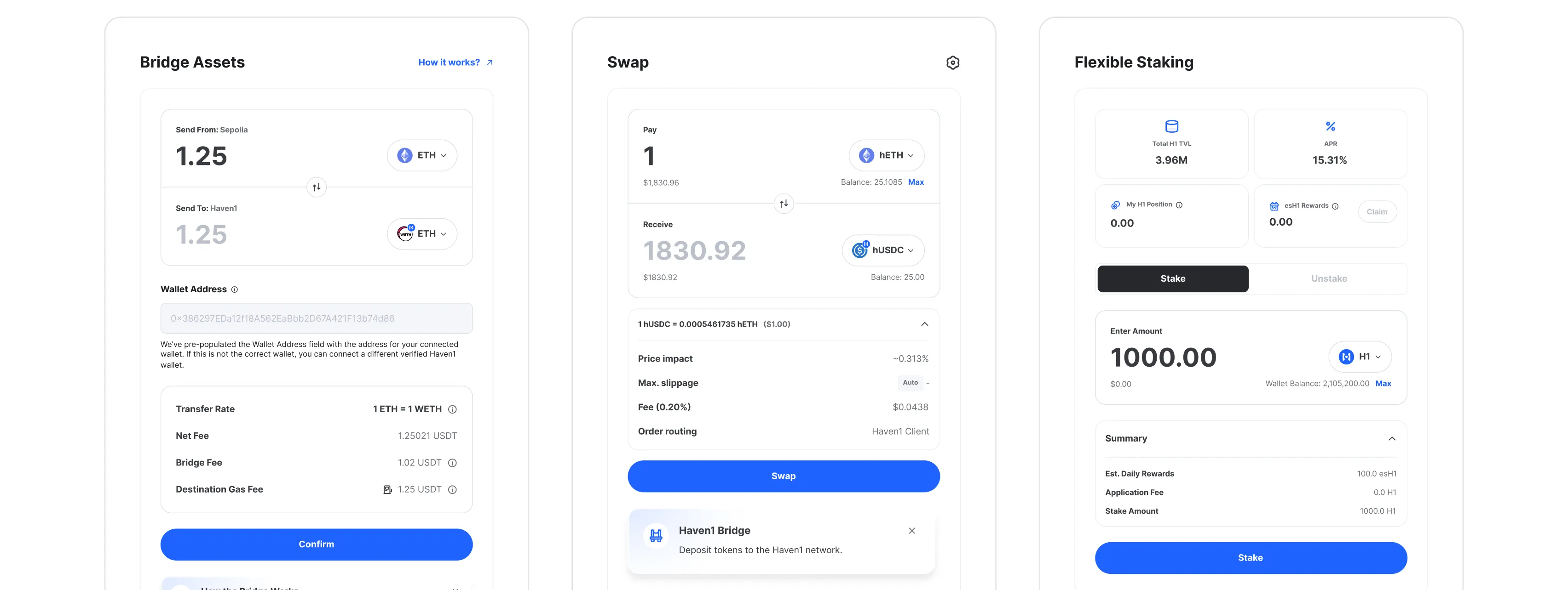
Haven1 set out to create a secure and user-friendly Web3 portal that lowers the barrier for newcomers while maintaining depth and transparency for experienced blockchain users. The goal was to unify fragmented DeFi tools: bridge, swap, staking, NFTs, and many more, into a cohesive ecosystem where anyone can interact confidently.
As one of two product designers, I helped craft the full user experience and developed a design system that accelerated delivery, improved developer handoff, and ensured long-term visual and functional consistency.
Live Product:
https://haven1.org/Period:
2023-2025
Deliverables:
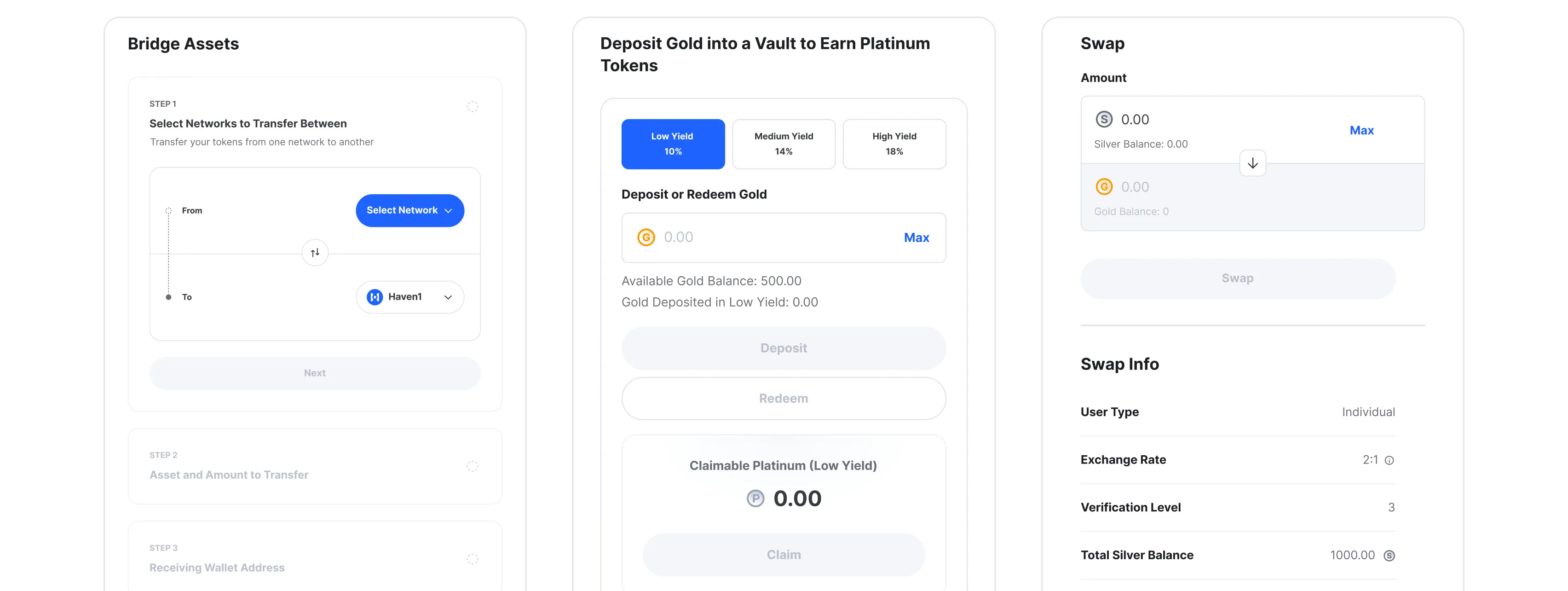
Multi-product Web3 Portal
Scalable Design System
Core dApp Interfaces
Team:
2 Product Designers (Lead + Me)
12 Developers
1 Product Manager
1 QA Engineer

The Challenge:
Building a scalable foundationwhile shipping fast
Haven1 was scaling 15+ DeFi products in parallel: Bridge, Swap, Staking, NFTs, etc, and other platform functions while preparing for Testnet launch.
Without a shared system, every new feature required re-creating basic patterns, slowing down design team (4 team members at the beginning) and development.
My goal was to establish a scalable, developer-friendly system that could evolve with the product instead of blocking it.
Approach & Process:
From fragmented screens to a unified language
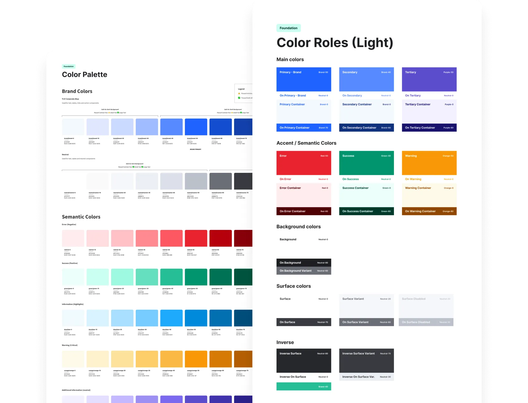
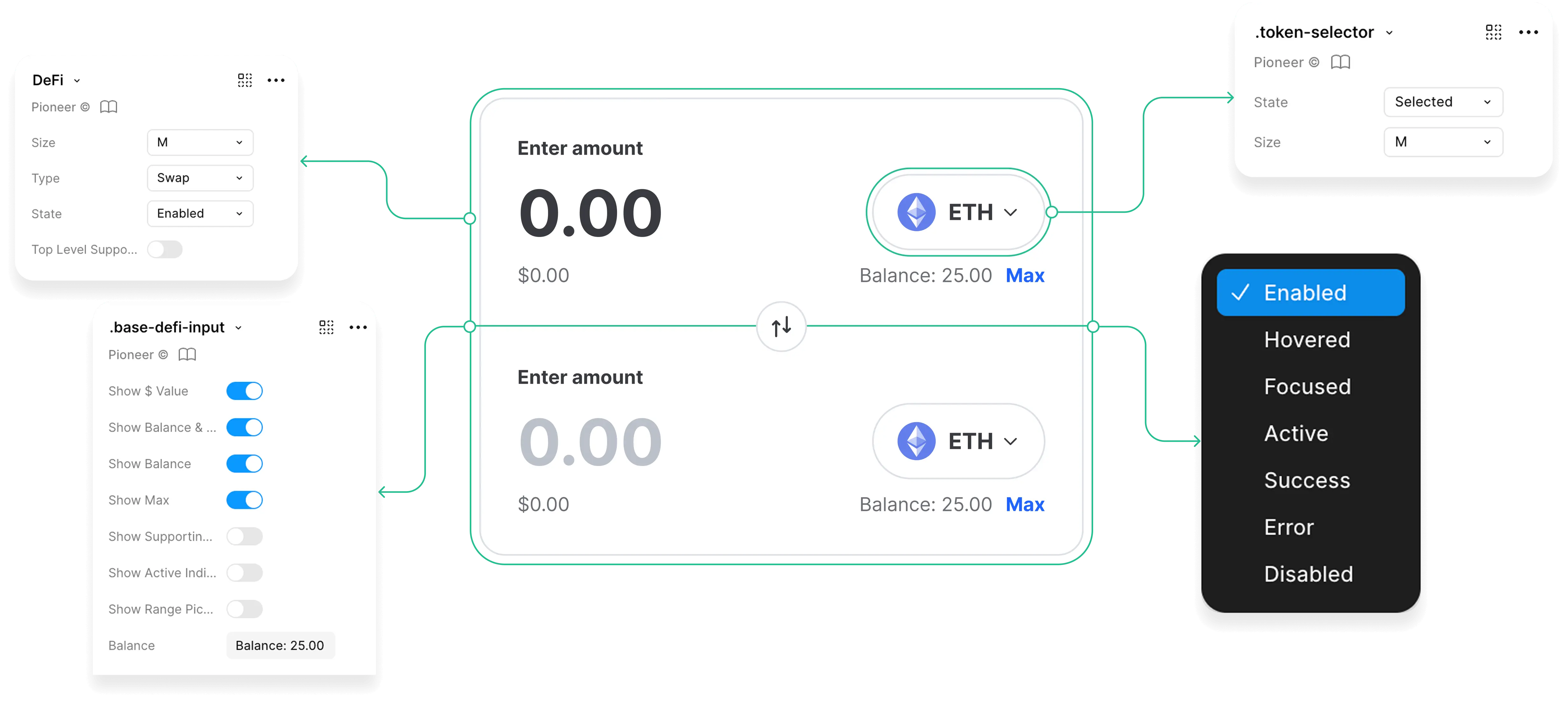
The process began with defining a clear semantic token structure - building a foundation for consistent color, typography, and spacing logic across all apps.
After that, we conducted a design audit of created products - Bridge, Swap, Staking, etc - to identify repeating UI patterns and opportunities for systematization.
Based on these findings, we created reusable components and aligned them with developers through close collaboration, ensuring technical feasibility and smooth token mapping for implementation.
Key Steps:
Building the Design System
1. Structure & Tokens
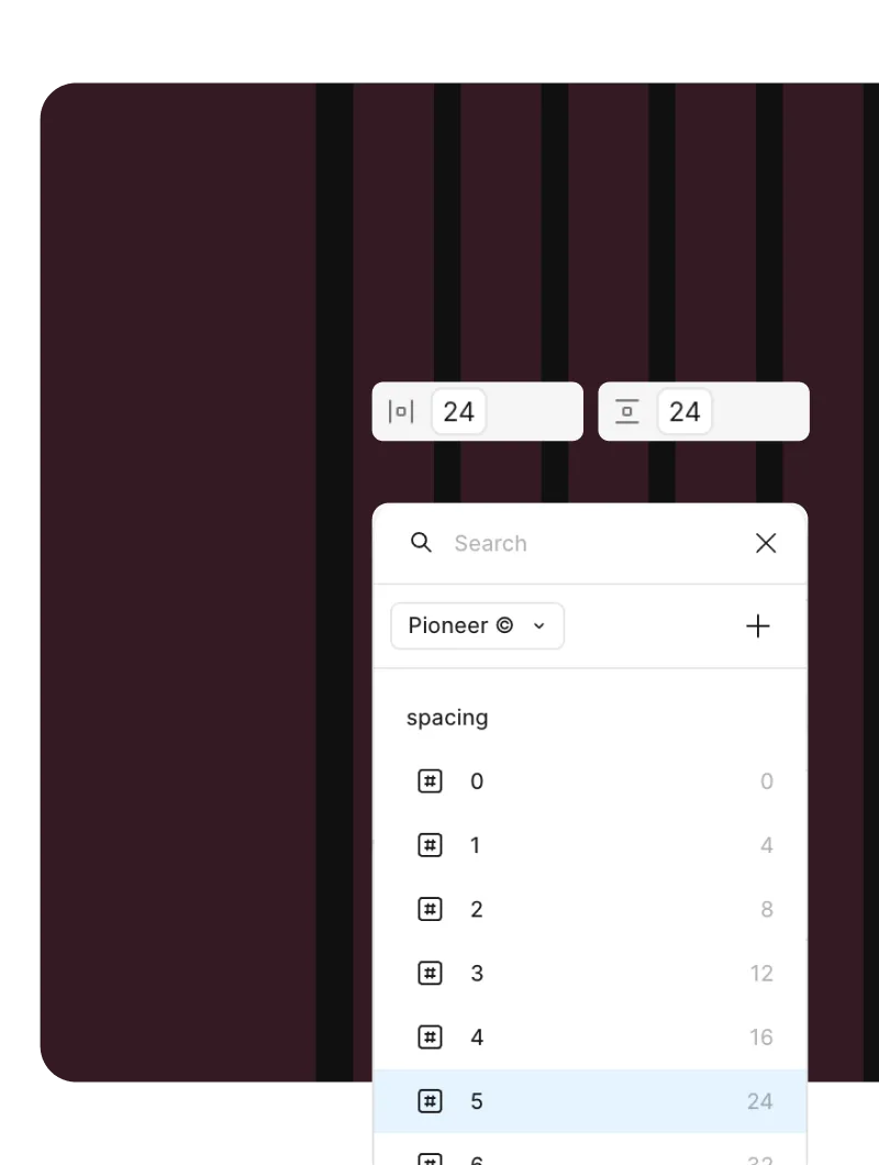
Established color, typography, spacing, and layout foundations.
2. Audit & Alignment
Gathered visuals from 6+ dApps, mapped inconsistencies.
3. Component System
Unified UI elements with clear naming and logic.
4. Developer Collaboration
Introduced Dev Mode and props for clean React mapping.
5. Iteration & Validation
Refined components through real use in Testnet features
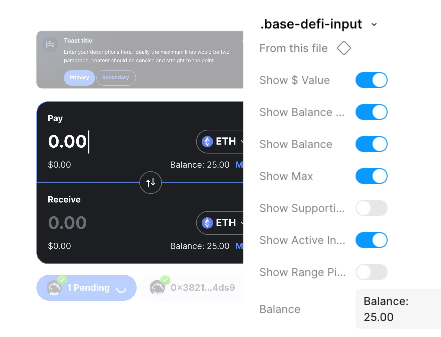
Design System Overview
A design system is more than visuals - it’s a shared operational language between design and engineering.
The Haven1 system established this shared foundation, enabling faster delivery, consistent UI, and long-term scalability across 15 DeFi apps.
Design System Overview
Semantic Colors & Tokens
Semantic palettes for product and brand use, structured for clarity and consistency
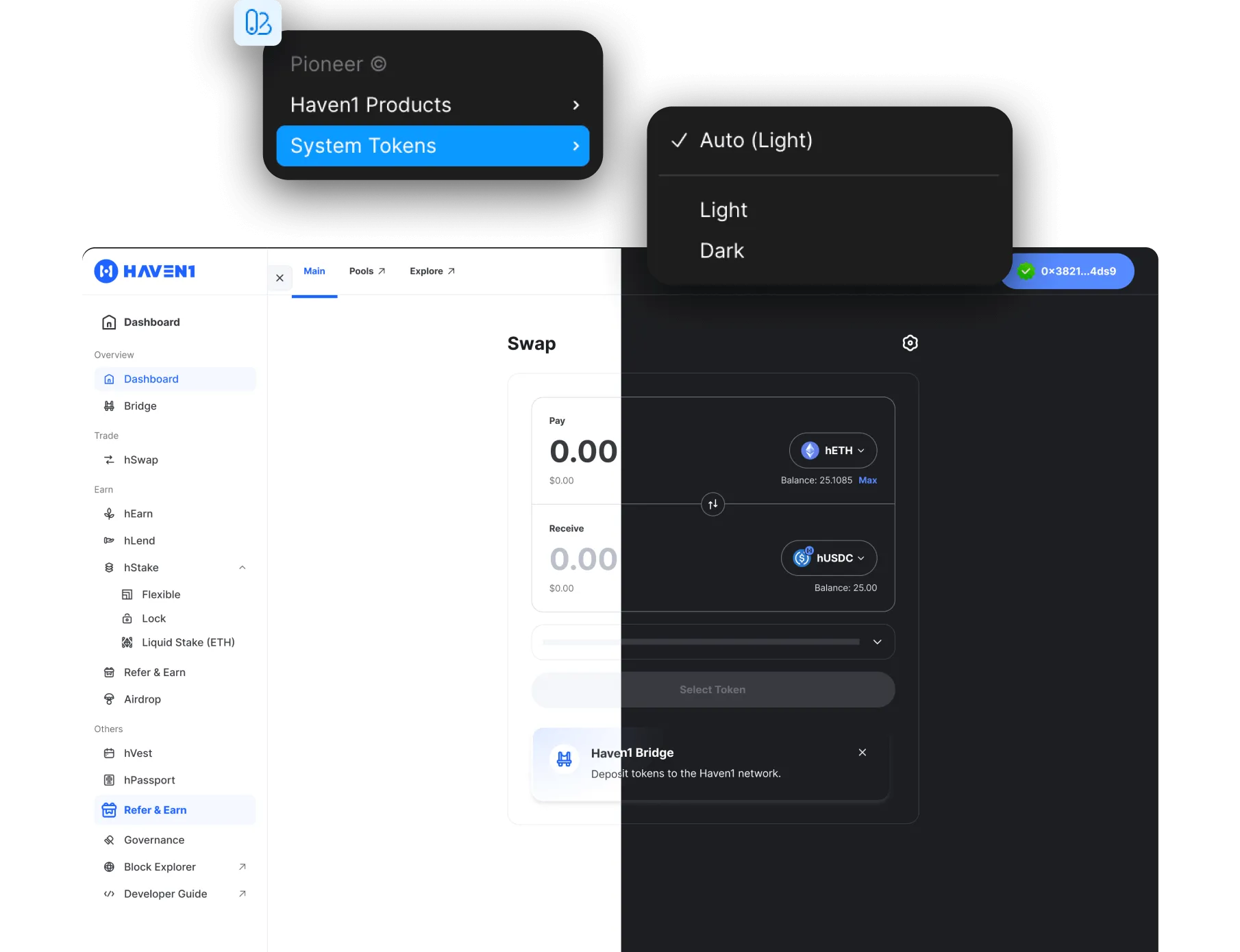
Light and Dark Modes
Semantic palettes for product and brand use, structured for clarity and consistency
Type Hierarchy & Roles
Semantic palettes for product and brand use, structured for clarity and consistency
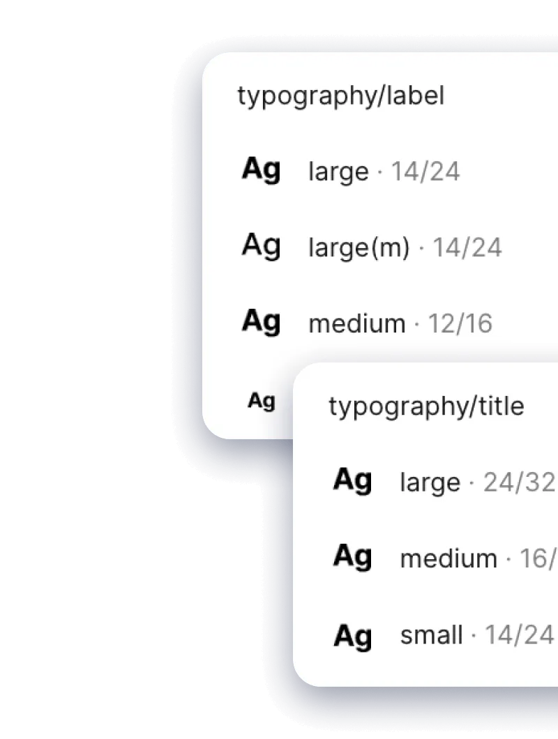
Type Hierarchy & Roles
Semantic palettes for product and brand use, structured for clarity and consistency
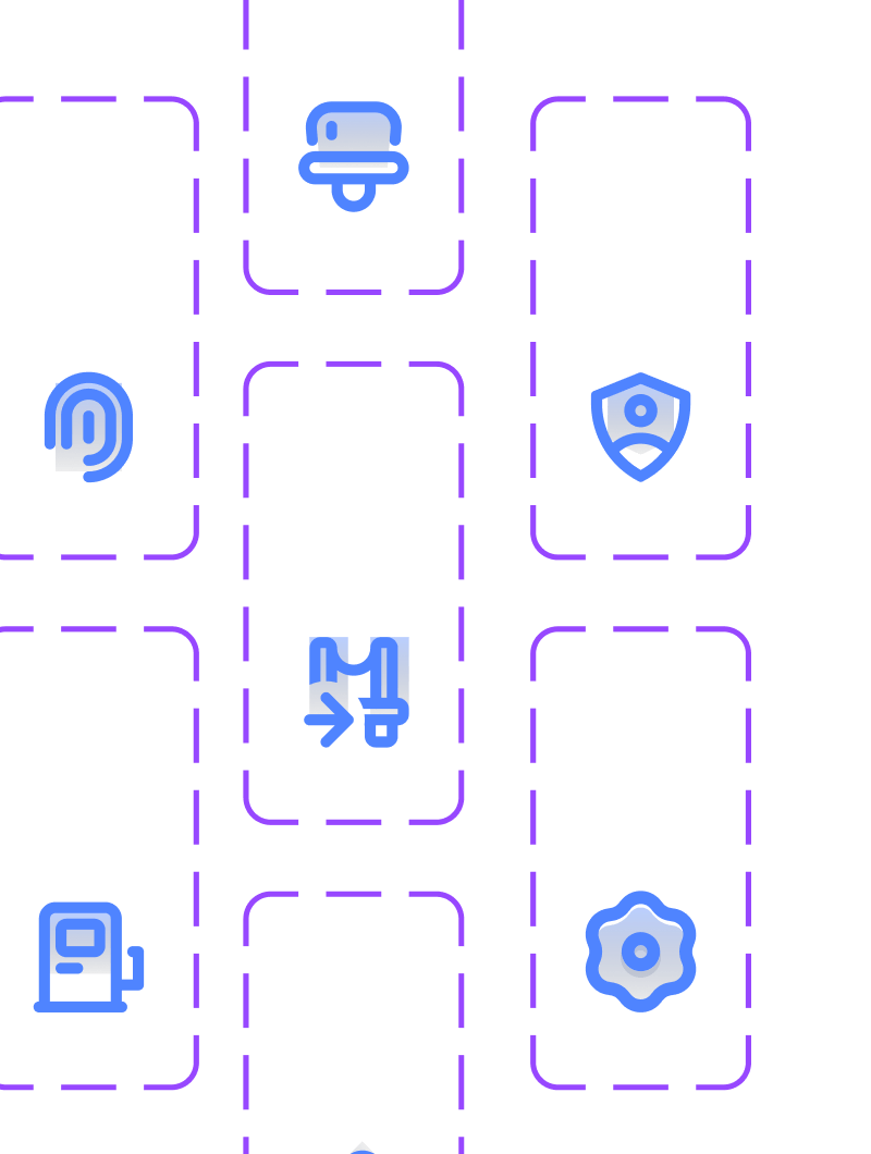
200+ Icons
Semantic palettes for product and brand use, structured for clarity and consistency
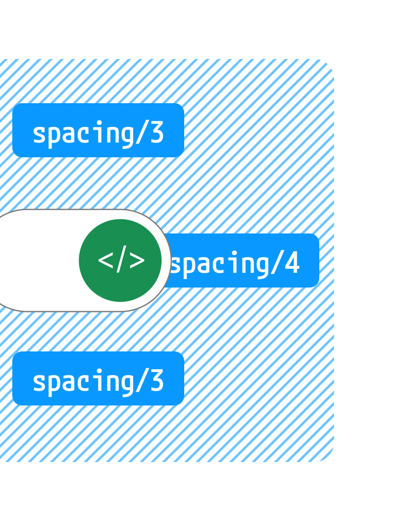
Dev Mode
Semantic palettes for product and brand use, structured for clarity and consistency
Reusable Components
Semantic palettes for product and brand use, structured for clarity and consistency
Responsive Layouts
Semantic palettes for product and brand use, structured for clarity and consistency
Impact
By introducing a unified design language, we transformed how designers and developers worked together - eliminating rework, speeding up delivery, and enabling fast scaling across 15 interconnected apps.
Achieved 1:1 parity between Figma and code
Unified components across 15 dApps
Reduced design-to-dev handoff time
Efficient light-dark mode design switch for all new screens
Faster responsive screens preparation
Redundant components cut
Delivery velocity for new features improved
Simplified onboarding for new team members
on-chain transactions
verified users
Learnings:
Designing for both creativity and code
Creating the Haven1 design system reinforced that design isn’t just about aesthetics - it’s about building bridges between creativity and engineering.
Balancing visual clarity with technical precision allowed the team to ship faster while maintaining a cohesive product identity.
What’s Next:
Design Systems for the New Era
The next stage of design systems is not just about maintaining consistency - it’s about intelligence, adaptability, and continuous collaboration between design and code.
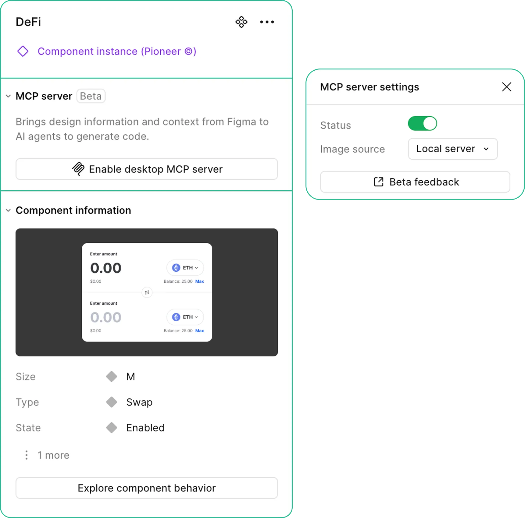
With the release of Figma’s MCP Server and Make Kits, the line between design and engineering is becoming fluid. Now, systems can sync live with production code, auto-generate components, and use AI agents to maintain design parity across tools.
This evolution perfectly resonates with my work on Haven1 - where bridging design and development wasn’t just a process improvement, but the foundation for scalable, human–machine collaboration.
Exploration Focus:
Design systems in the AI age
Design systems in the AI age
I’m currently exploring how token-driven architecture and AI-assisted Dev Mode
can enable self-updating systems where components understand their logic, context, and behavior in both design and code.