Evolving Haven1’s bridge from a single-chain MVP into a scalable, intuitive multi-chain experience.
When Haven1’s bridge was first launched, it supported a single network and a limited set of tokens - a minimal viable product aimed at validating the core transfer logic. As user demand grew and the ecosystem expanded, we needed to redesign the bridge to handle multiple chains and assets while maintaining clarity, safety, and ease of use.
As part of the design team, I did audit, analyzed pain points and defined the redesign direction, simplifying the mobile experience, clarifying token flow, and aligning visuals with the evolving Haven1 design system.
Live Product:
https://haven1.org/Period:
2023-2025
Deliverables:
Multi-product Web3 Portal Scalable Design System,
Core dApp Interfaces
Team:
2 Product Designers (Lead + Me)
12 Developers
1 Product Manager
1 QA Engineer

The Challenge:
evolving to cross-chain mobile-friendly experience
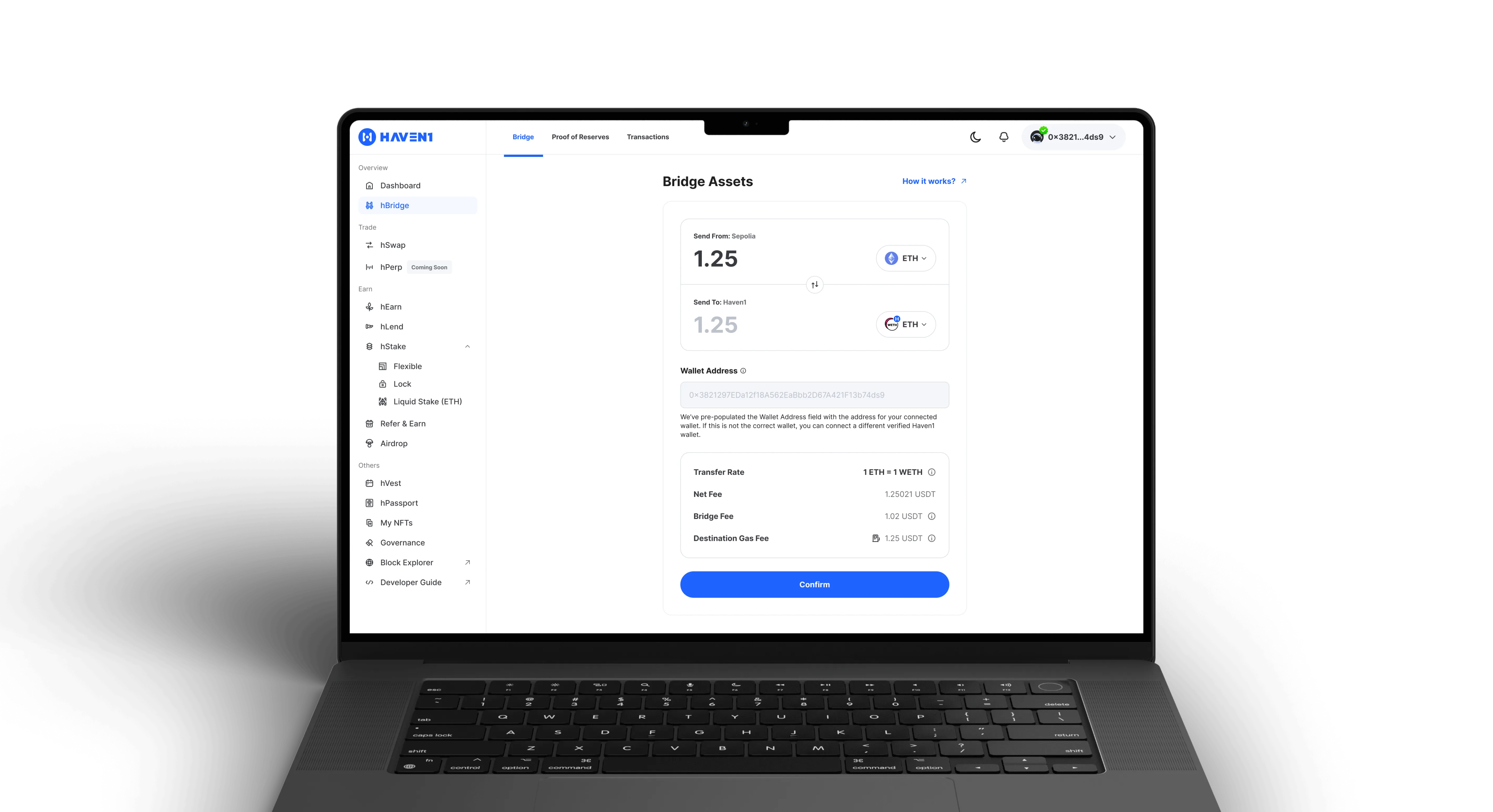
The first version of the Haven1 Bridge was designed as an MVP supporting a single network to validate the core transfer logic. As the platform evolved, the Bridge had to scale to multiple chains and assets while maintaining clarity and speed. However, the MVP layout became cluttered, especially on mobile, with duplicated UI elements and many devided transfer steps.
My main challenge was to simplify the experience without losing technical depth - helping users navigate cross-chain transfers faster and with more confidence.
Approach & Process:
From complex flows to a clear, unified transfer journey
We started by analyzing user behavior and identifying pain points in the existing flow - especially on mobile screens, where users struggled to follow multi-step transactions.
Based on these insights, we simplified the step structure, unified similar components (amount input, token selector, unified summary component, confirmation modals), and improved visual hierarchy for better focus.
In close collaboration with developers, we aligned the UI and technical logic for multi-chain support, ensuring smooth integration and visual consistency through the design system.
Key Steps:
Redesigning the Bridge Experience
1. Problem Analysis
Reviewed user feedback and observed issues with clarity, mobile usability, and repetitive steps in the MVP version.
2. Information Architecture
Mapped the existing flow and restructured transfer steps for better logic and visibility.
3. Simplified UI & Components
Unified amount inputs, token selectors, and confirmation elements to reduce redundancy.
4. Mobile Optimization
Redesigned layout hierarchy and spacing for small screens, ensuring readability and ease of use.
5. Alignment & Validation
Aligned the new Bridge visuals with the Haven1 design system and validated through internal testnet use.
Bridge Redesign Overview
The redesigned Bridge introduced clarity, scalability, and full mobile responsiveness, improving both usability and consistency.
The redesigned flow simplified complex cross-chain transfers into a clear, guided journey while ensuring flexibility for future integrations. Unified components and a cleaner hierarchy helped users complete actions faster and reduced confusion between network and token selections. This structure enables users to bridge assets seamlessly while ensuring long-term scalability for new upcoming networks.
Bridge Redesign Overview
Cross-Chain Support
Scalable structure for multiple networks.
The new Bridge flow supports seamless transfers between chains while keeping the interface lightweight.
Mobile-Friendly Layout
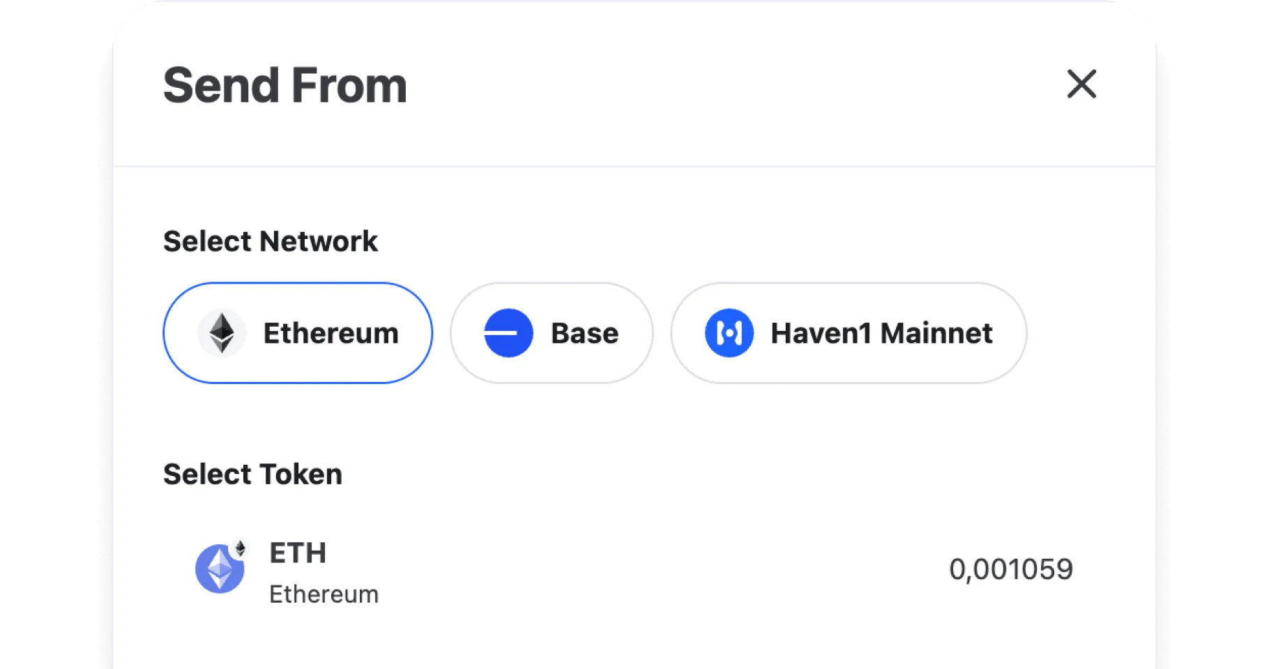
Optimized spacing, hierarchy, and step visibility for smaller screens. Previously, network and token selections were split into separate pop-ups, forcing users to switch context and tap multiple times.
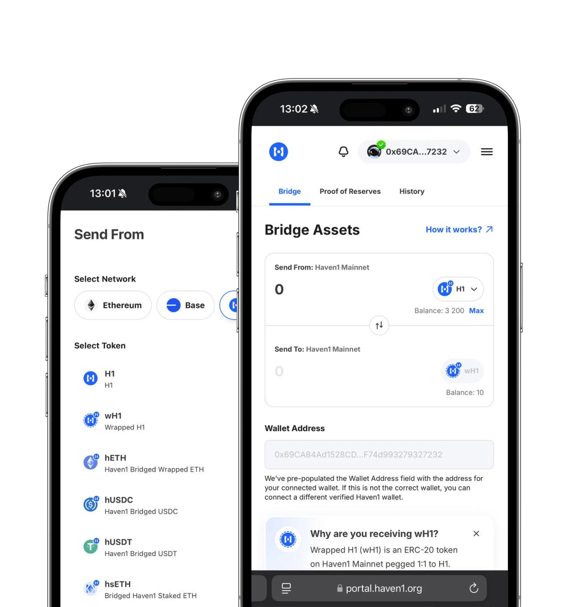
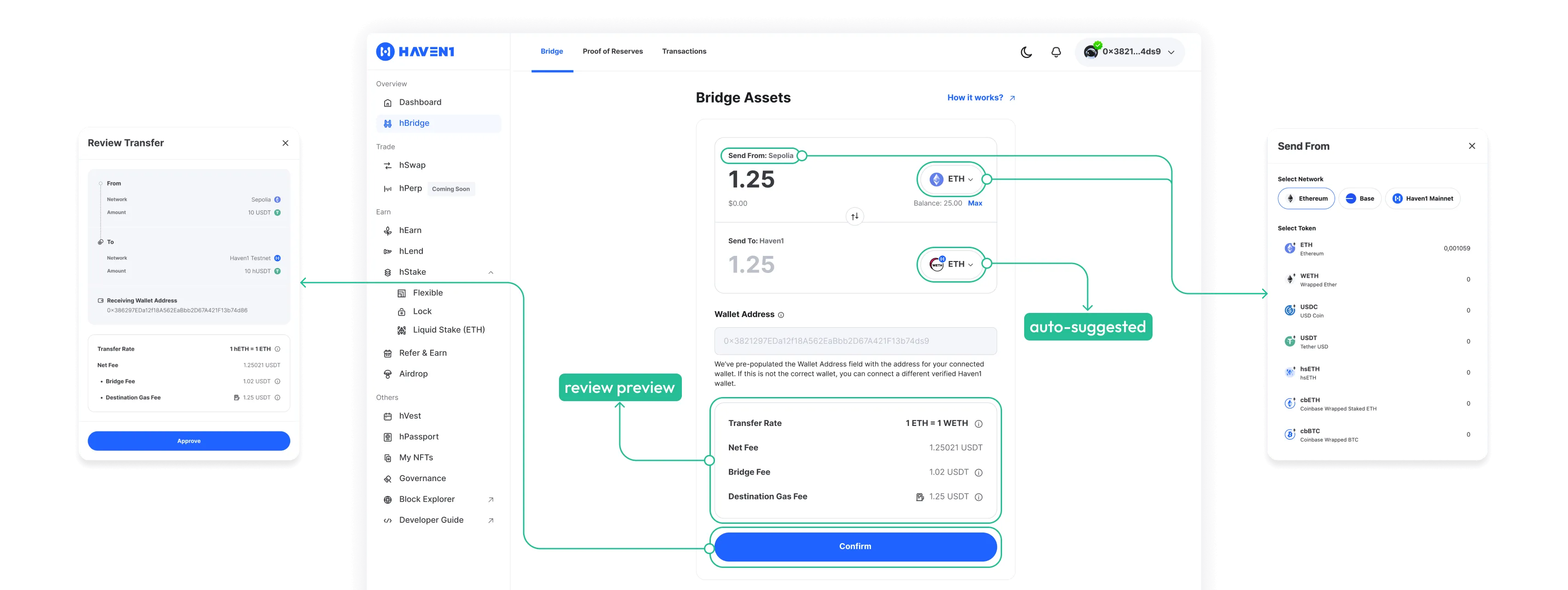
Now both are shown in one combined view — users can instantly see available networks and tokens, while the system auto-selects the most relevant pair by default once they choose the “From” network.
Simplified Flow
Unified 3-step journey for all transfers.
Condensed the process into clear stages - Select, Review, Confirm - each visually separated yet smoothly connected. Users can now see key details like rates, wallet address, and network fees upfront, with real-time transaction updates guiding them through completion.
This structure minimized confusion, reduced failed transfers, and made the multi-chain process feel seamless.
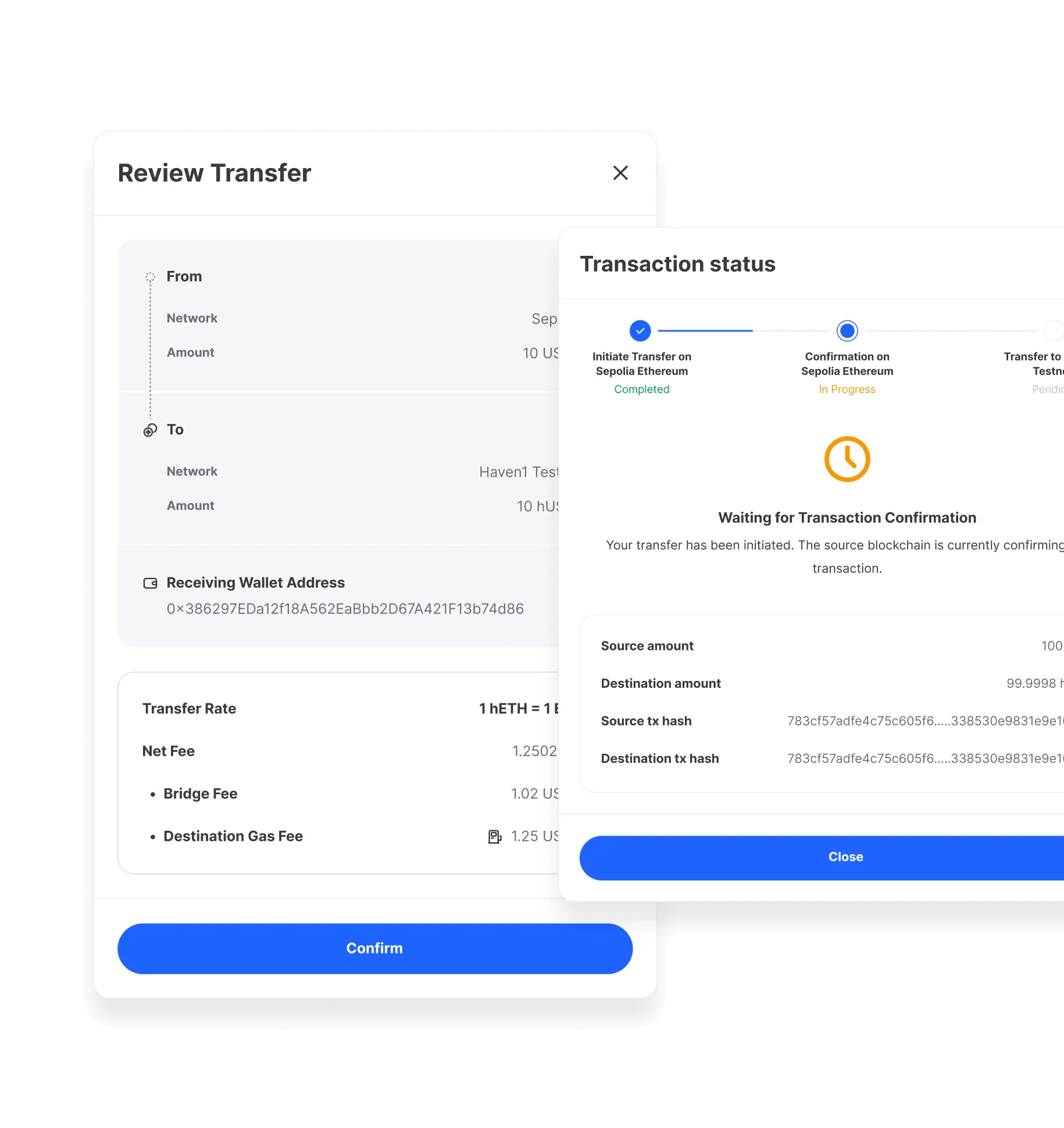
Unified Components
Each component was adapted for variable states and network logic, maintaining both flexibility for future features and a cohesive user experience.

Impact
The updated Bridge UX improved speed, clarity, and developer alignment.
fewer screens per transaction
faster mobile completion rate
clarity in network/token selection (based on feedback)
alignment with Haven1 design system
on-chain transactions
verified users
Before Bridge Redesign
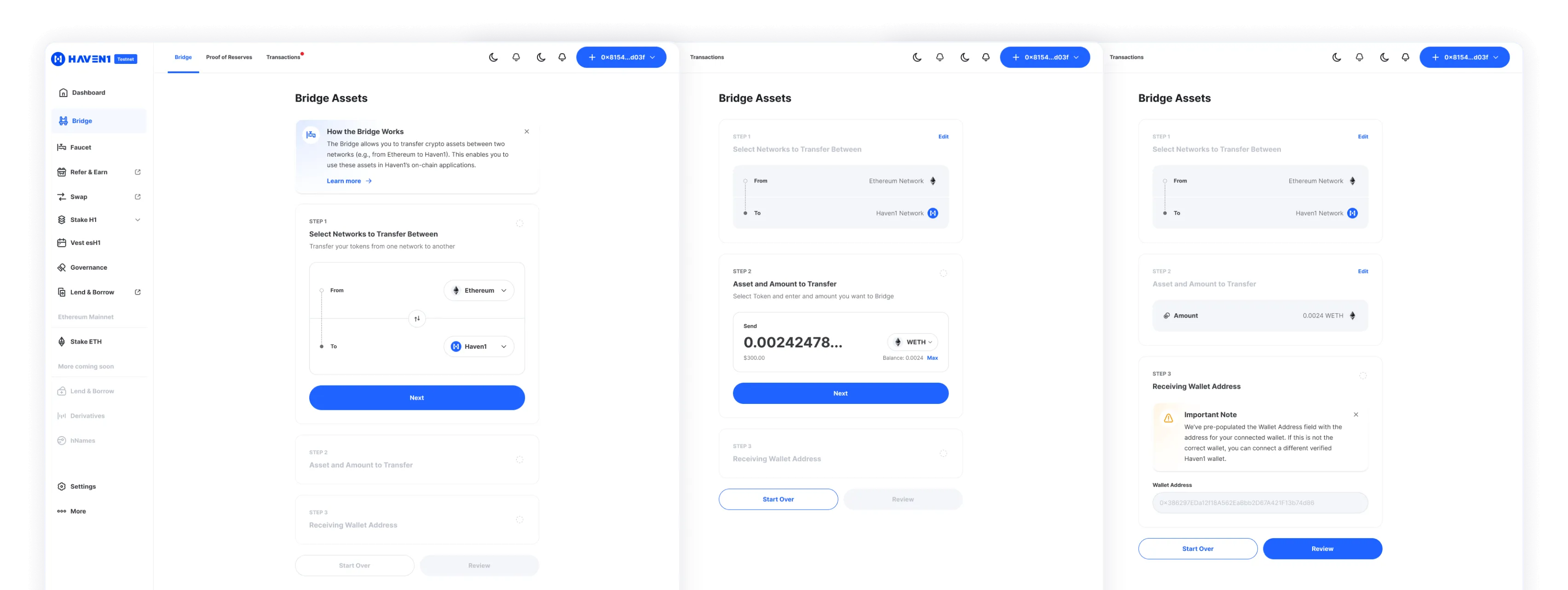
The original Bridge consisted of 3 separate steps, each with supportive explanations:
- Selecting From and To networks
- Choosing a token and entering an amount
- Confirming a pre-filled wallet address and reading explanatory notes
This structure was intentionally designed for new Web3 users during Testnet, providing step-by-step education about the transfer process. However, it made the interface too segmented, required multiple pop-ups for network and token selection, and felt heavy on mobile, where users had to tap and switch context several times.
After Bridge Redesign
The new flow unified these fragmented steps into a single, streamlined experience.
Networks and tokens now appear in one combined selector, automatically pairing the most relevant options once a user chooses the source network. A built-in preview allowed users to see fees before proceeding to the next steps. This redesign shifted the Bridge from a tutorial-like flow to a scalable interface that supports both beginner clarity and advanced user efficiency.
Trade-off:
Guided tutorial vs single-screen efficiency
Working on the Bridge redesign highlighted a key trade-off between guidance and efficiency. New users needed reassurance and step-by-step guidance to feel confident completing their first cross-chain transfer.
At the same time, experienced users wanted speed, control, and a minimal, single-screen flow without unnecessary friction.
Instead of choosing one audience over the other, the solution balanced both: progressive guidance for first-time users, with a simplified, one-screen experience for returning users.
What’s Next: Further Bridge Experience Improvement
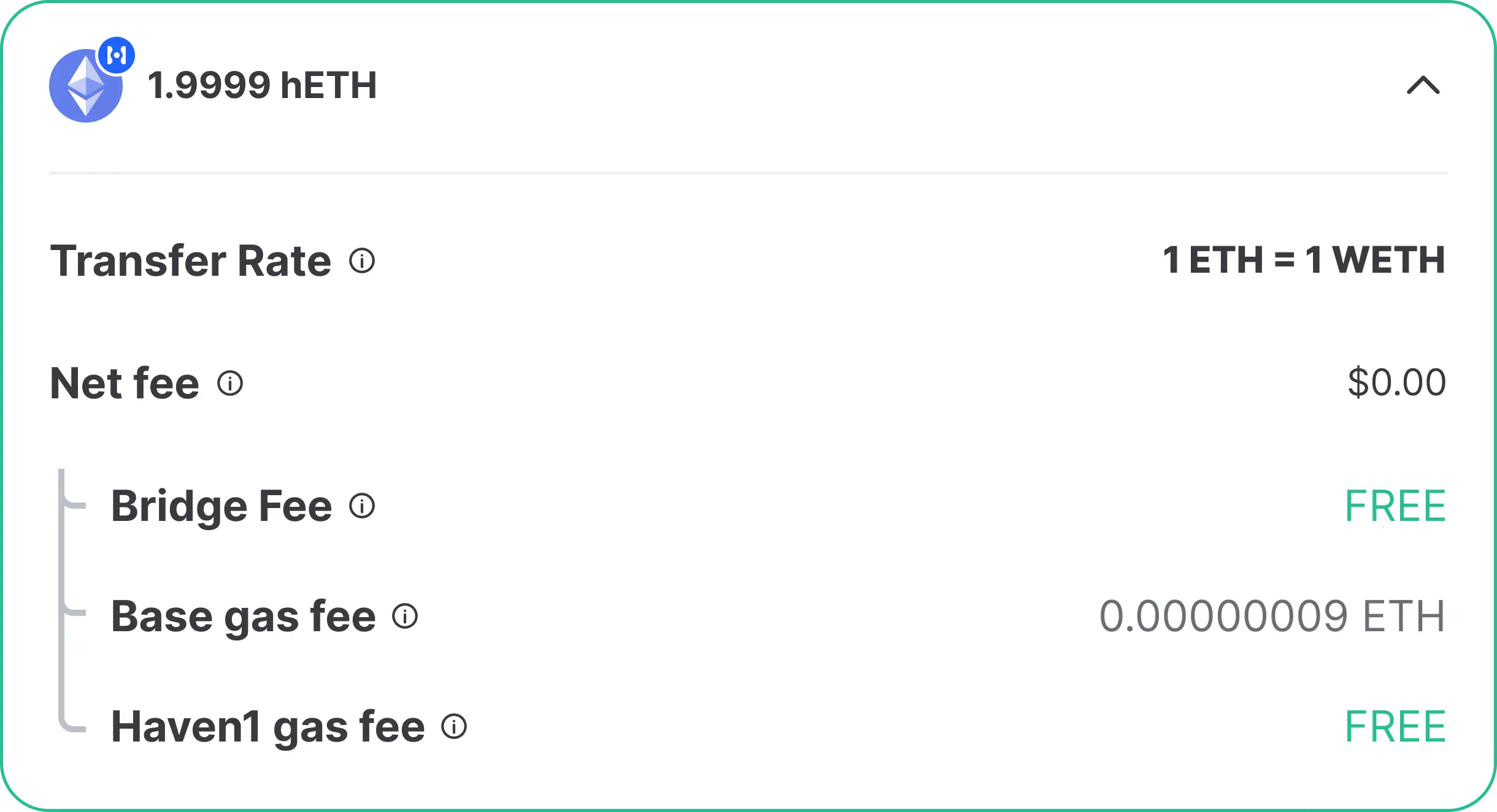
- Enhanced Fees Breakdown: displaying detailed gas and bridge fee sources across chains for better transparency.
- Network Suggestion Logic: improving auto-selection based on user history and liquidity availability, and expanding support for more networks.
- Transaction Tracking UX: evolving the status modal into a unified tracker with real-time confirmations and cross-chain progress, even after the modal is closed, users can still track transaction status.
- Consistent Component Expansion: extending the updated Bridge components to other Haven1 dApps to ensure system-wide consistency.
